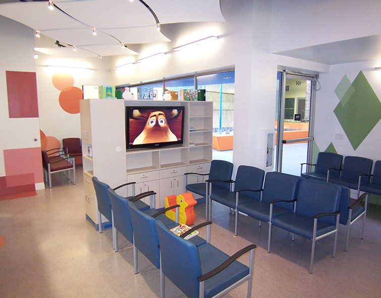
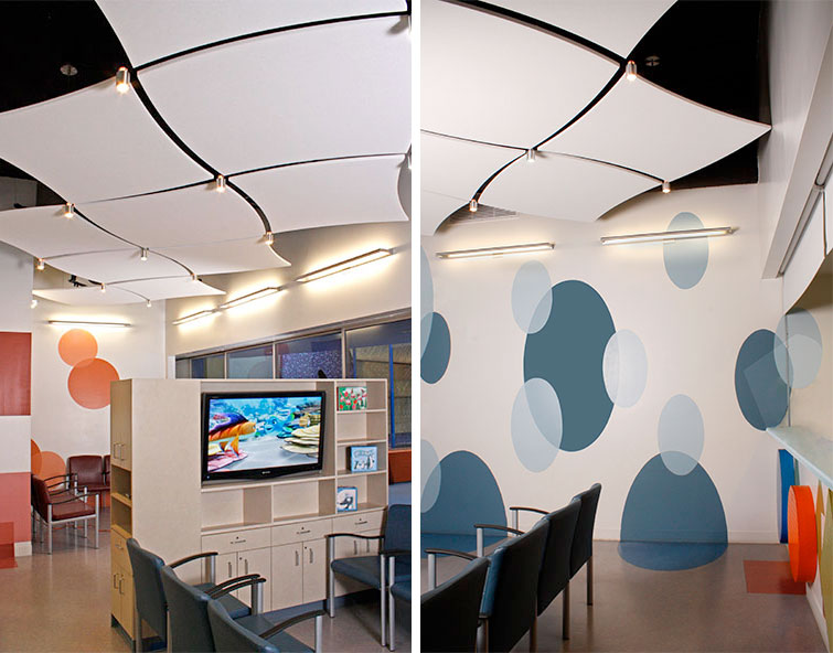
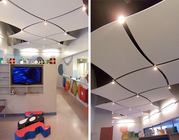
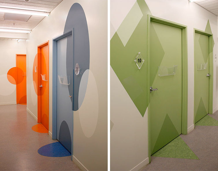
Recognizing the importance of reducing anxiety on the part of the children who visit the UCLA Pediatrics Clinic, our firm created a playful setting enlivened by bright colors and simple geometrical shapes. Circles, squares and rectangles were painted on the walls and cut into the floor to minimize an institutional feel and, instead, create a welcoming place that helps children to feel safe. By overlaying shapes painted in a gradient of color we also added depth and dimension to small individual spaces within the 3,500-square-foot clinical facility.
Our choice of graphic shapes and vivid colors also served a practical purpose, with each color/shape combination assigned to a physician to serve as a simple way finder. By following the appropriate color and shape, children and parents can easily find the appointed doctor’s exam room—again, easing the anxiety of patients and their families alike.
This project involved addressing the constraints of a limited budget and a fast-paced schedule, as well as developing the design within a relatively small footprint. We relied on simple, straight lines to simplify the construction process, while creating a vibrant environment that conveys the warmth and enthusiasm of the UCLA Pediatrics staff.


